My Spring 2021 Art Newsletter with All Kinds of Arty Thoughts
Susan Kennedy Studio Spring Newsletter
May 6, 2021
____________________
Thank you for being a supporter or subscriber to my newsletter!

“Study: Making it to the Edge of the Woods,” a new abstract in my Spring Show on my site
I’d love to invite you to see my “Spring Show” paintings listed on my website gallery! (one of the paintings is shown above, and the paintings include my realism as well)
I’d also REALLY love to invite you to check out and preorder at a temporary SUPER low price (or free if you have Prime) my new painting book “Painting Landscapes with Light and Depth,

My new landscape book coming out this May
a labor of love and an explanation of my thoughts and methods behind the realistic landscape painting which has dominated my artistic life. It comes out May 28, 2021! Scroll down to the bottom of this newsletter to see an excerpt, and find another one here on my blog.
An Artist’s Quandary – Spring 2021
Me with my beloved two genres
So I’ve got a familiar situation this spring, as I load up my galleries with new paintings: am I a realist or an abstractionist? I just can’t pick, and I hope that my art supporters are getting used to it and tolerating my ambivalence with hopefully kind indulgence: “That Susan Kennedy! Why doesn’t she just pick a style already? Silly lady! Hahahaha…” is how it goes in my (self-important?) head.
I’ve found support and encouragement for both realism and abstraction. I love both realism and abstraction. I’ve done both for decades (or at least decade, in the case of abstracts). And I can just hear my millennial kids saying, “What’s the big deal? Why do you need to pick?” I guess I’m coming at it from a traditional point of view that you need to have a consistent body of work. You don’t want to dilute your efforts as an artist by dashing about impulsively experimenting with this and that. So I feel silly.
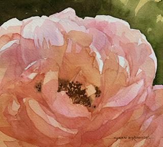
This small watercolor depicts one of the coral roses my mom grows here in North Georgia.
But I’m trying to set myself free from all those compunctions. I’m going to continue to feature both Susan Kennedys on my website and blog and Instagram. The realism are my statements about beauty and sadness in the natural world (sadness because I’m documenting what is disappearing). The abstracts are faith statements and dream-like visions (if you will) about what my journey is like, what my life is like, what I aspire to, what heaven is like (I hope.) A few are explorations of mental illness which has touched our family. So…THANK YOU for giving me the freedom to be me!
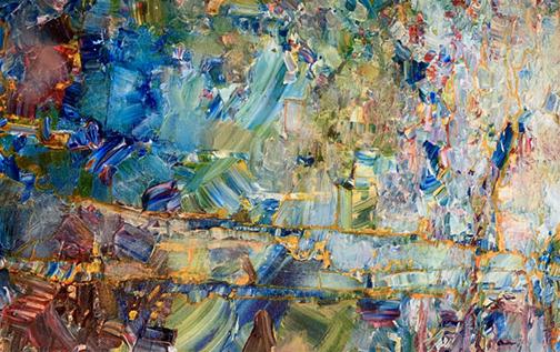
This is a detail of “Stained Glass Dream,” a large abstract which is almost done!
Coming out of Quarantine
I feel abashed when I think about how, after a few weeks of shock and sadness last March), I really enjoyed quarantine. It gave me time off from work (I do work as a graphic designer and photoshop artist); it gave me a desire to spend a TON of time outside, and it gave me such a break from usual social activities and busy-ness. What a recipe for creativity and happiness for an artist who happened to be insulated from the virus and from financial insecurity. So I painted.

This painting was from a camping trip – socially distanced – we took during quarantine in October 2020
The painting above is one of the many paintings I completed in 2020, many of which have ended up at Turning Leaf Gallery in Blue Ridge Georgia. It’s been a year and a half of great turmoil and growth, and I’m grateful. So keep checking in with me, and thank you for your indulgence and support!
Encouragement to PAINT!
And here is an excerpt from my new eBook (Print Length 135 pages, possibly coming this year as a paperback), “Painting Landscapes with Light and Depth,” a portion of the six Chapter 6 demonstrations which show you how I work through a realistic landscape, balancing tones – dark and light values – as I go along.
Painting a Rocky Forest Stream
Keeping an Eye on Tonal Relationships in a Landscape
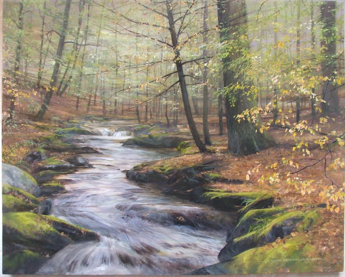
I had an opportunity to paint a commission for a lady from Massachusetts a few years ago. I can’t remember where she was from, and I can’t find the photos she sent me showing her favorite little woodsy stream, but I do remember painting it and enjoying it immensely. The cool feeling, the mossy rocks, the rushing stream were bits of a scene that looked like a haven of peace and beauty.
I first did a little watercolor sketch to show to my client to indicate how I hoped to depict her beloved haunt in the woods:
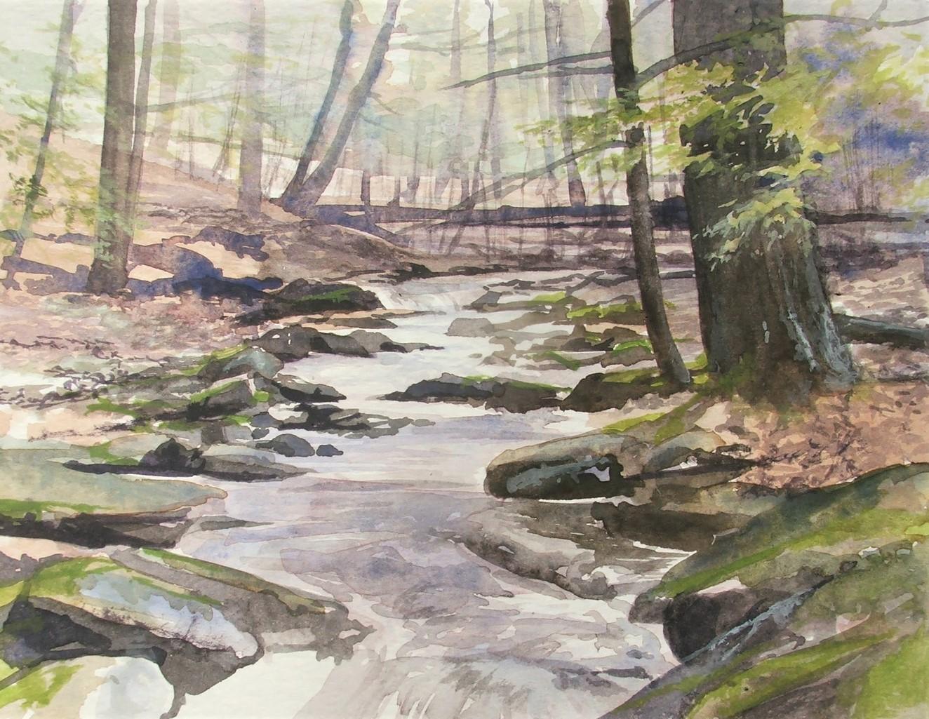
Using some reference photos from a client, I did a watercolor sketch to place all of the elements that I wanted to include.
In this case, I chose not to use a toned or colored canvas because I wanted the background to be pale and quiet.
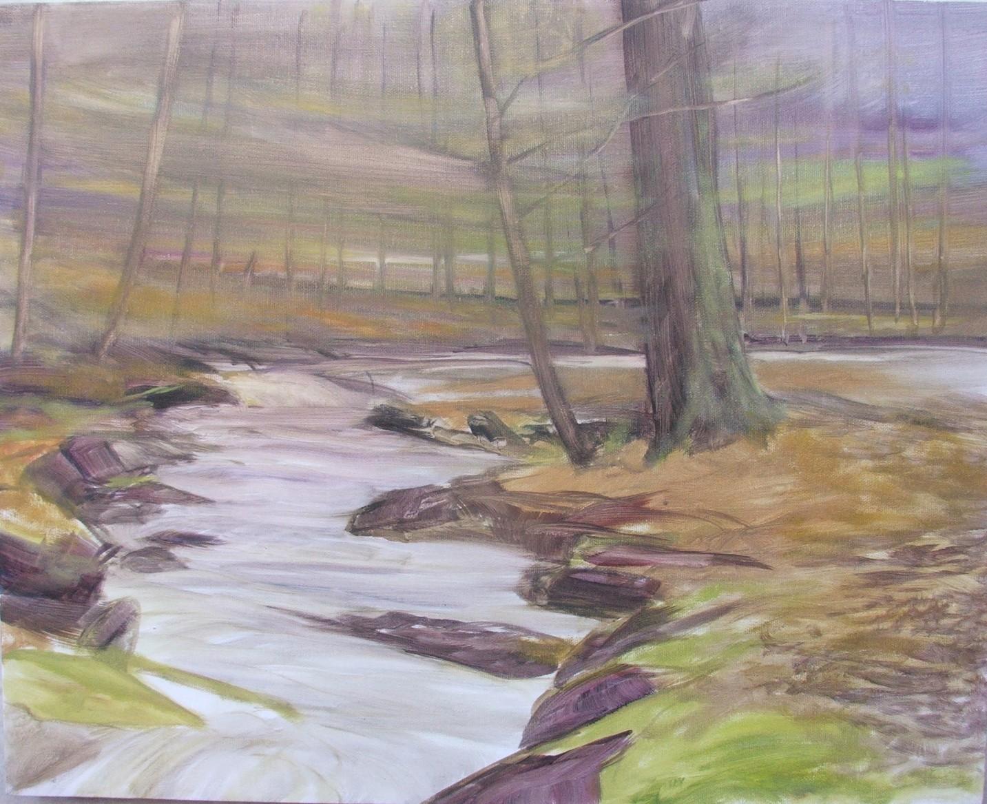
My first stage of the painting was to lightly render the shapes of the scene in thin layers of oil paint. This underpainting was to lock in shapes and their relationships to each other.
First I sketched in a pale underpainting in my actual colors, scrubbing the thin paint in with quick, rough strokes. I was using water mixable oils at the time and thinned my paint with water to get an almost watercolor effect on the canvas. I was using large to medium flats for this part of the painting.
I used my usual palette of landscape colors for this painting: pale lavenders in the distance made with ultramarine blue and alizarin crimson; black/greys made with sepia and ultramarine; browns made with burnt sienna and a wide variety of additions (yellows, reds, and black); and greens mixed with sap green, Winsor yellow and a touch of red every now and then.

I started to build the variations in tone and hue which each section would have. In my typical fashion when I’m using traditional layered oil painting approaches (think thin layers), I worked on all of the areas concurrently to keep them in balance in terms of shape and tone.
The next few hours were spent building up tone and variations in hue in the many different areas of rocks, leaves, water and trees. I felt that this was going to be a challenging painting to keep balanced in tone and composition, so I gradually built up dark values in the rocks and pale variations in tone/value in the water.I used my black and black mixed with Ultramarine for most of these areas. At the same time I was adding tonal as well and hue variations in the moss and leaves: sap green mixed with little bits of yellow here and red there. I was still using medium and large brushes, not thinking yet about details and boughs of leaves.
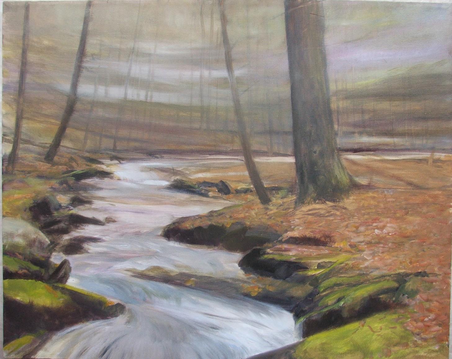
Bit by bit, I carefully darkened the darks in the rocks which would create a zig-zagging path for the eye to enter the painting and travel back in space.

Adding detail and pale highlights
I was still using thinned down paint on the water, adding blues and lavenders (using ultramarine and Winsor Red mixed with white) and starting to use pure white to add to my browns and background colors to pick out luminous highlights in the soft lighting of the woods. When I had sufficient pale tones highlighting the background areas, I restated the trunks and began to add more in light to medium-light gray tones. I felt that keeping the background pale was essential to creating a sense of space and depth, particularly as the middle and foreground held such high contrast darks.
Together with the color and value compositional balancing I was doing was the addition of more detail with smaller flats and filbert brushes. I was adding small curly brushstrokes to indicate leaves and I had three or four variations of browns to show the variety in the forest floor. Dead leaves on the ground can be difficult, but my best efforts have involved varieties in the colors together with tiny lines and cracks rendered with dark darks showing that the mat of leaves is punctuated with lots of little crevices. In a similar was I was starting to make fluffy tiny brushstrokes of pale vivid spring green colors to give the moss realism and softness; the dark blacks I was painting on for these mossy areas gave real pop and impact to the spring moss colors.
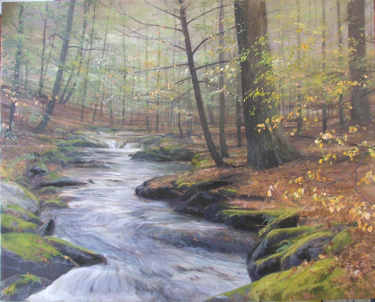
Sticking with my method of layering elements on top of previous elements, I continued to build my painting, dressing my bare trees with more branches and with the beginnings of leaves. I wanted the leaves to be a compositional element which would add depth and also point the viewer in towards the middle ground area which was supposed to be a little haven or glade in which the viewer’s eye would rest. I could picture my client enjoying this spot in her hikes through this area.
I used Sap Green with touches of yellow and a lot of white; occasionally I would add bits of burnt sienna to make a variation in the leaf colors which was a bit warmer in color.
The last touches were adding tiny details in the middle area to keep interest: leaves of differing hues but all pale in value, dark soft strokes of black-brown to indicate dark rocks under the rushing water, more highlights of white to depict the small cataract (almost a mini waterfall in the distance). I felt that, to the very end, this painting was an exercise in balancing tones to serve the composition.
Thanks once again, and may you have a wonderful Spring and Summer of joy and happiness!
Susan
home | about | contact/subscribe | portfolio | videos | eBooks | blog
website: www.susankennedy.com
facebook: https://www.facebook.com/susankennedyart


Comments
Post a Comment