New Upcoming Book on Painting Landscapes with Light and Depth (for Oil and Acrylic Painters)
Painting Landscapes with Light and Depth
If you would like to preorder this book which will be available on May 28, click here.

What is depth? To me, a painting’s portrayal of depth is its ability to make the background look far and the foreground look near. A good sense of depth means that a scene doesn’t look flat, but dimensional. It involves the painter’s skill with color, value, shape placement, and focus (in the sense of blurry vs. sharp).
So how does the realistic landscape artist paint with convincing depth? I’d like to share a list of the things that I try to keep in mind as I attempt to create a convincing sense of distance.
You can easily see how objects which are blurry look like they are behind objects which are shown in sharp focus. This is because the human eye only perceives one area in sharp detail, and that is the thing at which it is looking, its focal area. The other things all around appear blurry.
In a similar way, if you present to a viewer a flat image which has followed this general concept of sharp focus in subject/soft focus in periphery your realism in this regard will strike a chord. That is not to say that less realistic presentations of landscapes which have a different priorities aren’t good landscapes: they can have great impact and success as works of art. However, if realism is your love, tending to focal balance is a great step into more advanced painting techniques.

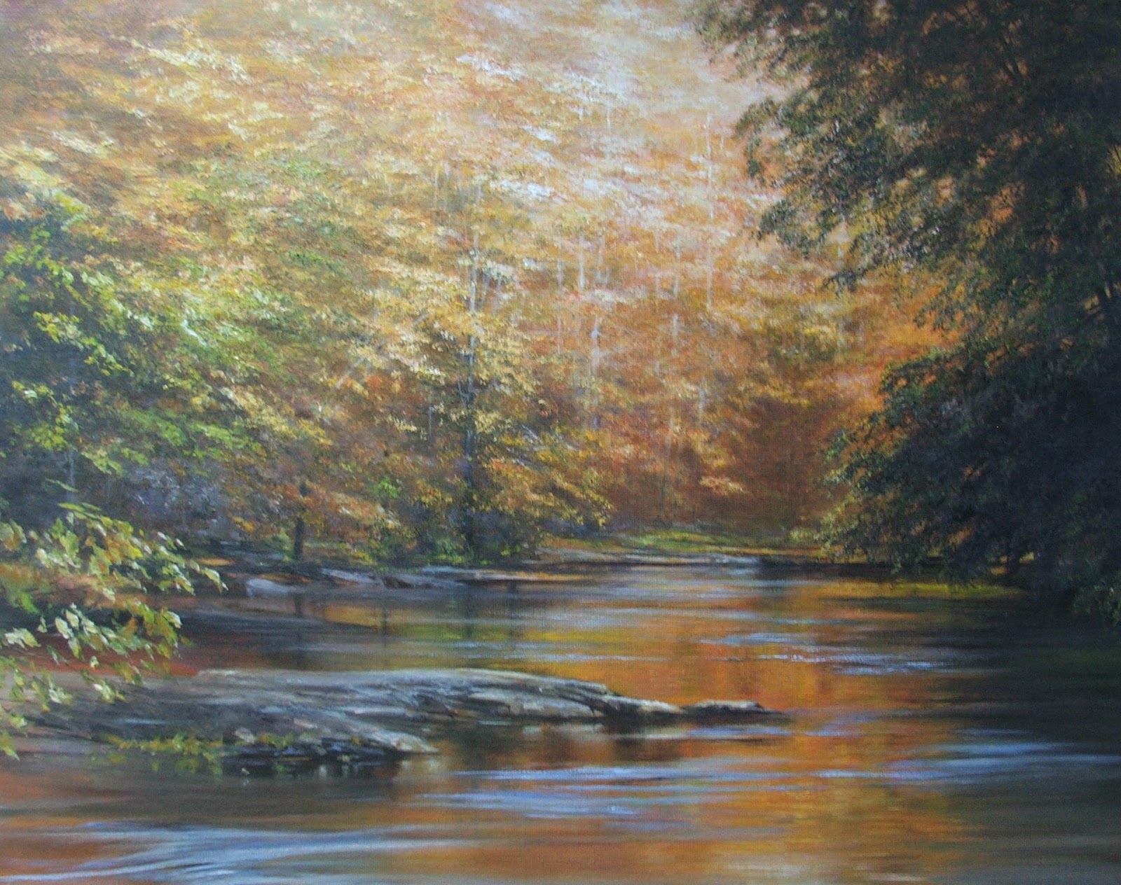
This painting shows with a simple scheme of foreground, middle ground with a subject, and background how keeping the sharpest focus on the subject - with softer, blended strokes in the background and foreground - can help to effectively convey a sense of spatial depth.
Try to use your sharpest, most precise brushstrokes in the subject area. Personally, I find that bristle brushes leave sharper, more grainy shapes of color which describe detail better. I’ll also use liner brushes to describe individual trunks, branches and twigs in the subject area, and refrain from doing so elsewhere.
To keep your passages in the background softer in focus, use (predictably) softer brushes: when I want a soft background or a soft margin between, for example, mountain and sky, I’ll blend that line between the two areas with a soft dry white nylon flat. Other areas of the background will be softly described with softer brushes as well, if I’m trying to keep that soft focus .Likewise in the foreground, I may use bolder strokes to pull in the viewer, but I’ll often still keep those strokes soft and blended so as to save the detail and attention for the subject. This soft/blurry focus rule is one I routinely break so as to experiment with other brushstroke shapes, but it’s a good rule to know so that you are aware when you are breaking it.


This idea of “pointing” the viewer’s eye inward to impart a sense of spatial distance overlaps with the concept of perspective. Portraying perspective in a landscape is using line, shape and relative size to show a sense of depth. When you are drawing man-made objects which have straight lines like buildings and roads, accurately using perspective rules is crucial, and there are many good books on using perspective. But do you really need to know perspective rules to do natural landscape? Yes! The lines of a landscape may be more irregular, jagged and soft than the lines of buildings, but they still diminish in size and flatten out as you move farther toward the horizon line (the point at which sky meets land - which may be obscured by hills, trees and clouds). In the painting above and in other paintings on the following pages you can see how shapes (clouds, trees) diminish in size as they get farther away and also, in the case of clouds, flatten out as they get closer to the horizon line.

This is because, as the viewer looks up at a cloud above her head, the cloud is not viewed at an angle; but as the clouds get farther away, the clouds are being viewed at more and more extreme angles. Therefore they become more and more like flattened ovals to the viewer, diminishing almost to the point of appearing like flat lines. This accurate portrayal of perspective is, to me, crucial to convincing realism in a landscape (In a way similar to clouds, accurate perspective is very noticeable in an artist’s portrayal of waves or ripples in the ocean: closer waves are farther from each other and larger in size, while more distant waves become closer together as they diminish inapparent size). Again, you can break this rule with abandon if realism is not a primary goal, but if it is something you value, this concept is one to keep in your back pocket at all times.
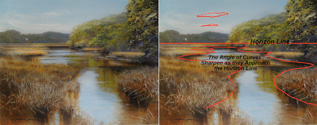
This concept of spatial perspective and flattening of shapes as they become more distant is very noticeable in the cases of rivers and roads as well, since they are curved, noticeable shapes that trace a path (often) all the way from foreground to background and horizon line. I frequently noticed as a painting instructor that beginning painters would make the curves in their rivers too smoothly curvy when they were in the distance. It often helped to study how spatial perspective will dictate a flattening of a path as it approaches the horizon line. To illustrate this, look at the figure below and notice how the shape of the river (or a road) changes as the angle of the viewer becomes lower to the ground, as is normally the case when looking out across a vista. The river shape at the top of the diagram shows a more usual point of view of a now flattened shape of a river; the whole scene is flattened, and,compared with the more straight passages of the river, the sharp bends in the river apparently widen out, and their edges are sharper. This is something you can look for and depict in your realistic landscape painting.

As the viewer’s standpoint becomes lower to the ground, a view of a river or path will be sharper at the curves, with the width of the river apparently wider as well.
You can see an example of the changing curves of a stream as it becomes more distant in the example below. This painting is from a day we spent tramping around Botany Bay on Edisto Island, South Carolina. I love the amazing shapes of the marshes, the birds and the hazy colors. It’s a great subject if you want to convey open spaces and a sense of distance and light. I was going for that feeling when I depicted the creek as it snaked through the marsh: the curves of the stream look rounded and spread out before the viewer at the bottom of the painting where we are close to the water; closer to the distant horizon line, the shapes of the bends in the stream are sharper because we’re viewing them at a much flatter angle.
The shape of river banks will be more rounded when seen close by; when viewed at a distance and at an oblique angle, the shapes of these banks will be sharper and thinner (not to mention smaller)


A large tree farther in the background could possibly look larger than a small middle ground tree. But do pay attention to the size cues in your composition. In particular, make sure that an arbitrarily placed tree trunk does not extend closer into the foreground than you intended. Remember: the higher up the base of an object, the farther away that object is.

In a similar way, the colors in the mountain scene below shift toward the blues, and even in the far background, the lavender colors as they go back in distance from the viewer. That is not to say that there aren’t sunlit patches on the middle range of mountains, but the shadow areas still keep their blued hues.

The distant trees and mountains appear progressively blue as they become more distant because the intervening light particles which are scattered the most are the light particles at the blue end of the spectrum. Your painting is a flat two dimensional object, so it is up to you to mimic what is happening in the atmosphere.
Please note: I hope to add more material to this preview as I work on my manuscript. There will be chapters on Materials, Sketching and Photographing for your Landscapes, Planning and Laying out a Painting, Painting with Light, Painting with Depth (excerpted above), and Six Step-by-Step Landscape Demonstrations. There will be more than 130 pages packed with more than 120 illustrations and photos. If you're interested in this eBook on painting landscapes, you will be able to pre-order soon! (I'll revise this post to add the link). In the meantime, please check out my instagram for more posts about art and updates on books, or look for my art ebooks on Amazon Kindle.
Excerpt - Chapter 5: Conveying Depth
Creating a painting which inspires a viewer to remember the feeling of a place or a time in their memory is probably the unstated aim of many landscape painters. If the art is realistic in style, all sorts of unspoken rules are consulted in judging it: is there an impression of distance? Do the colors look real? Are the relative shapes of the elements (perspective relationships) right? Most of us can’t verbalize why a landscape painting looks “right” and doesn’t get in the way of its message with awkward placements or color choices. In this section I’d like to put into words some of the techniques I have learned for making a scene have a convincing sense of depth.
So how does the realistic landscape artist paint with convincing depth? I’d like to share a list of the things that I try to keep in mind as I attempt to create a convincing sense of distance.
Keep detail and sharp focus mostly in the subject.
You can easily see how objects which are blurry look like they are behind objects which are shown in sharp focus. This is because the human eye only perceives one area in sharp detail, and that is the thing at which it is looking, its focal area. The other things all around appear blurry.
In a similar way, if you present to a viewer a flat image which has followed this general concept of sharp focus in subject/soft focus in periphery your realism in this regard will strike a chord. That is not to say that less realistic presentations of landscapes which have a different priorities aren’t good landscapes: they can have great impact and success as works of art. However, if realism is your love, tending to focal balance is a great step into more advanced painting techniques.
This painting shows with a simple scheme of foreground, middle ground with a subject, and background how keeping the sharpest focus on the subject - with softer, blended strokes in the background and foreground - can help to effectively convey a sense of spatial depth.
Try to use your sharpest, most precise brushstrokes in the subject area. Personally, I find that bristle brushes leave sharper, more grainy shapes of color which describe detail better. I’ll also use liner brushes to describe individual trunks, branches and twigs in the subject area, and refrain from doing so elsewhere.
To keep your passages in the background softer in focus, use (predictably) softer brushes: when I want a soft background or a soft margin between, for example, mountain and sky, I’ll blend that line between the two areas with a soft dry white nylon flat. Other areas of the background will be softly described with softer brushes as well, if I’m trying to keep that soft focus .Likewise in the foreground, I may use bolder strokes to pull in the viewer, but I’ll often still keep those strokes soft and blended so as to save the detail and attention for the subject. This soft/blurry focus rule is one I routinely break so as to experiment with other brushstroke shapes, but it’s a good rule to know so that you are aware when you are breaking it.
Enlist the shapes of skies and branches to direct the viewer’s eye inward into the horizontal plane of your landscape.
Shapes are important to a realistic landscape painter. In the shapes of clouds and of foreground forms like branches or trees, you can use the arrangement of the shapes to point the viewer’s eye inward. In the painting below, the clouds point the viewer’s eye to the subject area, the farm in the center right area of the middle ground. This is one of the rules of composition, but it also is important in conveying a sense of space. A viewer’s eye will ideally start out looking at objects near the edges of the painting, move inward deeper and deeper into the scene and the story, then linger there, hopefully resting here and there close to that subject.Use good spatial perspective lines, especially in skies.
This idea of “pointing” the viewer’s eye inward to impart a sense of spatial distance overlaps with the concept of perspective. Portraying perspective in a landscape is using line, shape and relative size to show a sense of depth. When you are drawing man-made objects which have straight lines like buildings and roads, accurately using perspective rules is crucial, and there are many good books on using perspective. But do you really need to know perspective rules to do natural landscape? Yes! The lines of a landscape may be more irregular, jagged and soft than the lines of buildings, but they still diminish in size and flatten out as you move farther toward the horizon line (the point at which sky meets land - which may be obscured by hills, trees and clouds). In the painting above and in other paintings on the following pages you can see how shapes (clouds, trees) diminish in size as they get farther away and also, in the case of clouds, flatten out as they get closer to the horizon line.
Using perspective rules on features like clouds and waves in the ocean will help you to create a convincing sense of spatial depth.
This is because, as the viewer looks up at a cloud above her head, the cloud is not viewed at an angle; but as the clouds get farther away, the clouds are being viewed at more and more extreme angles. Therefore they become more and more like flattened ovals to the viewer, diminishing almost to the point of appearing like flat lines. This accurate portrayal of perspective is, to me, crucial to convincing realism in a landscape (In a way similar to clouds, accurate perspective is very noticeable in an artist’s portrayal of waves or ripples in the ocean: closer waves are farther from each other and larger in size, while more distant waves become closer together as they diminish inapparent size). Again, you can break this rule with abandon if realism is not a primary goal, but if it is something you value, this concept is one to keep in your back pocket at all times.
This concept of spatial perspective and flattening of shapes as they become more distant is very noticeable in the cases of rivers and roads as well, since they are curved, noticeable shapes that trace a path (often) all the way from foreground to background and horizon line. I frequently noticed as a painting instructor that beginning painters would make the curves in their rivers too smoothly curvy when they were in the distance. It often helped to study how spatial perspective will dictate a flattening of a path as it approaches the horizon line. To illustrate this, look at the figure below and notice how the shape of the river (or a road) changes as the angle of the viewer becomes lower to the ground, as is normally the case when looking out across a vista. The river shape at the top of the diagram shows a more usual point of view of a now flattened shape of a river; the whole scene is flattened, and,compared with the more straight passages of the river, the sharp bends in the river apparently widen out, and their edges are sharper. This is something you can look for and depict in your realistic landscape painting.
As the viewer’s standpoint becomes lower to the ground, a view of a river or path will be sharper at the curves, with the width of the river apparently wider as well.
You can see an example of the changing curves of a stream as it becomes more distant in the example below. This painting is from a day we spent tramping around Botany Bay on Edisto Island, South Carolina. I love the amazing shapes of the marshes, the birds and the hazy colors. It’s a great subject if you want to convey open spaces and a sense of distance and light. I was going for that feeling when I depicted the creek as it snaked through the marsh: the curves of the stream look rounded and spread out before the viewer at the bottom of the painting where we are close to the water; closer to the distant horizon line, the shapes of the bends in the stream are sharper because we’re viewing them at a much flatter angle.
The shape of river banks will be more rounded when seen close by; when viewed at a distance and at an oblique angle, the shapes of these banks will be sharper and thinner (not to mention smaller)
Keep Objects in your Middle Ground Similarly Consistent with Perspective Rules.
Just as your cloud, river and road shapes need to obey perspective rules, so do the objects in your middle ground: make sure that, in general, trees, houses, and hills get smaller as they recede into the distance. Of course, there will be exceptions:Make sure that, in general, your trees and middle ground objects shrink in size as they recede into the distance.
A large tree farther in the background could possibly look larger than a small middle ground tree. But do pay attention to the size cues in your composition. In particular, make sure that an arbitrarily placed tree trunk does not extend closer into the foreground than you intended. Remember: the higher up the base of an object, the farther away that object is.
Skew colors of more distant objects toward the blue end of the spectrum.
A very important way to give your viewer an additional cue that an object is far away is to do what nature does: make your more distant objects more blue in color. In the painting below, you can see that the closest trees are more warm in color, the farther ones more green, the ones even farther back are blue in color, rather than green as a tree would be in your mind’s eye.In a similar way, the colors in the mountain scene below shift toward the blues, and even in the far background, the lavender colors as they go back in distance from the viewer. That is not to say that there aren’t sunlit patches on the middle range of mountains, but the shadow areas still keep their blued hues.
Please note: I hope to add more material to this preview as I work on my manuscript. There will be chapters on Materials, Sketching and Photographing for your Landscapes, Planning and Laying out a Painting, Painting with Light, Painting with Depth (excerpted above), and Six Step-by-Step Landscape Demonstrations. There will be more than 130 pages packed with more than 120 illustrations and photos. If you're interested in this eBook on painting landscapes, you will be able to pre-order soon! (I'll revise this post to add the link). In the meantime, please check out my instagram for more posts about art and updates on books, or look for my art ebooks on Amazon Kindle.
Thanks for reading! Susan
www.susankennedy.com


Comments
Post a Comment